


As we begin to come to the close of the Design-A-Day SpoonChallenge we can’t leave out one of our most important techniques: Typographical! Amy Peppler Adams, better known as pennycandy in the Spoonflower Marketplace, shares with us why this technique is fabulous (and easy) for new Spoonflower users and veterans alike.
Amy: When I found Spoonflower about six years ago, I was coming from a graphic design background. The first several prints I uploaded were typography based, because it seemed like the easiest way to transition into what was, for me, the whole new world of surface design. To this day, I still use type in the majority of my work, and often try to include at least one text-based design in each collection. But you don’t need an art degree to experiment with and enjoy using typography in your designs. Here are a few ways anyone can have fun with type.
A Type Puzzle
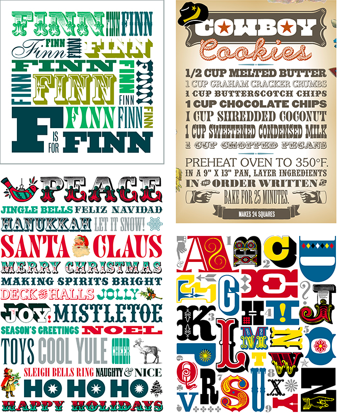
One of my favorite ways to use type is to fit it together like pieces of a puzzle (think Tetris, but with letters and numbers!). In the old days, before computers (B.C.!), this would have taken awhile. But now you can size and resize type with just one click.
Low Volume
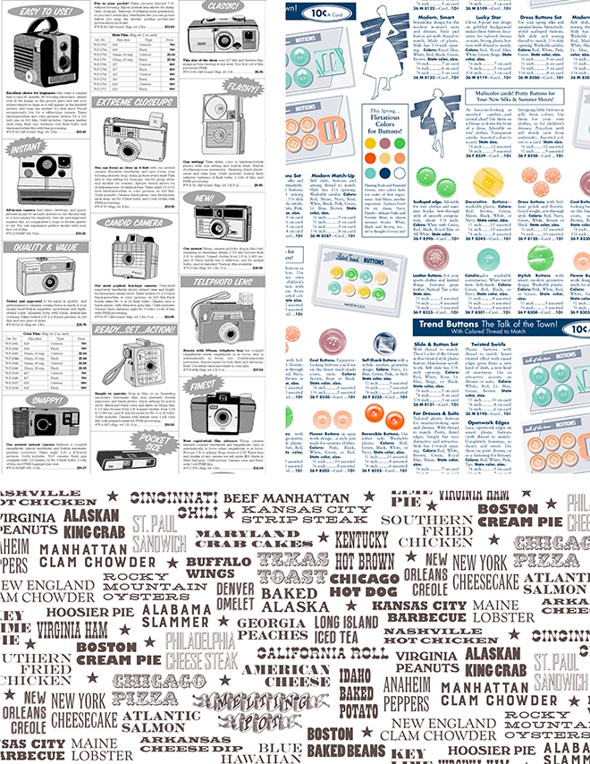
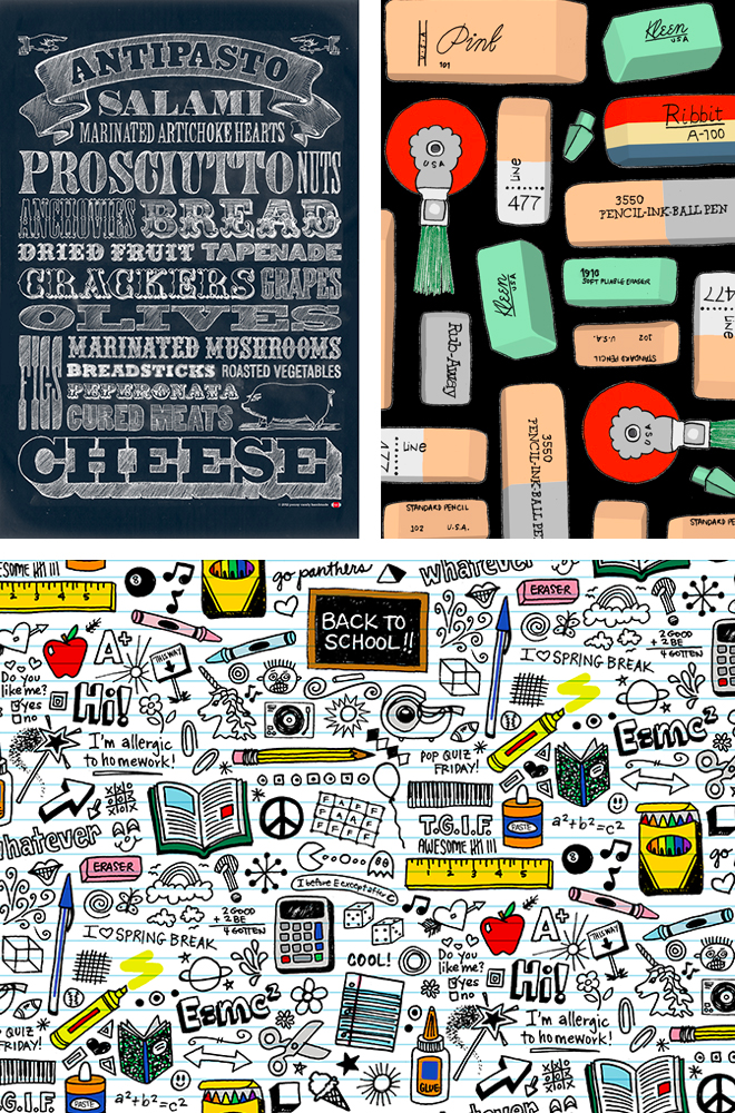
Another type-centric design usually falls into the “low volume” category, designed with one or two colors on a light background. Very popular with quilters these days, the low volume prints make nice neutrals that are more interesting than solid colors. Many text-based, low volume prints feature mock pages from a newspaper, magazine, or catalog.
Patterns
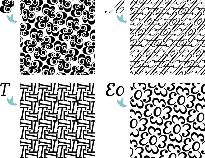
Typography can also be used to create repeating pattern elements, which in the final design may be no longer be recognizable as letterforms. This is really fun to experiment with, and there are an infinite number of possible outcomes.
Graphic Design
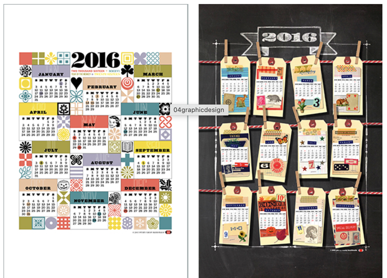
Then, of course, there are the designs for which some amount of type is necessary, like tea towel calendars. Though the information on calendars is always the same (names of the months, numerals for the year, and all those dates!), there are countless ways to organize it and make it pleasing to look at. Just make sure the numbers are legible and can be read at a quick glance, so the reader knows which date belongs to a particular day of the week.
Hand-lettering
All of the above styles can be created using hand-drawn type, which is currently very on-trend, and sometimes a more appropriate choice than slick, computer-generated fonts. Drawing type by hand is fun to play around with, and just about anything goes.
Amy’s Pro Tips:
- Try to choose appropriate typefaces to convey your message. A great way to get in the habit is to observe type around you; it’s everywhere!
- Trendy, pretty, or favorite fonts may not always work. You may find that a design created over 40 years ago isn’t “in style” right now, but it may work because it more closely resembles what you are are creating.
- Take advantage of the ornaments and special characters available in many font families. You will find lots of fun shapes and symbols.
- You don’t need chalk and a chalkboard to make chalk type. Create your design in pencil, then scan it and invert it in Photoshop.
- Need another coordinate in your collection? Lines of text make great stripes!
- Sometimes it helps if you start designing with type using only black and white. Generally, if a design works in just black and white, it will work in color. Then applying that color is just icing on the cake!
- And last but not least, just have fun and welcome unexpected results! Try lots of typefaces and see what works best. As with any method, sometimes your finished design will be completely different from what you initially imagined. Recognize unique traits of each character, or something about the words or phrases you are illustrating, that you could play up in an interesting way. Love those happy accidents!
Don’t forget to tag your designs influenced by today’s SpoonChallenge with #SFDesignADay. We’d love to see your typographical creations (or happy accidents) inspired by Amy!


Love your work! I am trying to create a few pieces myself but my fonts keep converting to other fonts when I upload to spoonflower. How do you keep your creations from changing? I am working with inkscape. thanks!
Thank you so much, Su! I’m so glad you found the post useful and most of all, inspiring! I was honored to participate!
Thanks for an information packed post Amy, what you write and show has stimulated me to try more typographical experiments (and I use to be someone who never liked type in fabric designs). Thanks too for your greatest tip: “… have fun and welcome unexpected results!” Your “Love those happy accidents!” sounds like a great motto to explore in a type-based design…
Thank you so much, Ceri!!!
Thanks, Tina! I know–while it would be great to always do chalk type on a chalkboard, the inverted pencil drawing technique is an awesome secret method!
Utterly fabulous. Always a big fan of yours Amy, but as a typography graduate myself, this especially appeals. Great tips!
Love your blog post Amy! So much incredible information! I especially love your chalk tip!